Little T's Treats
A website designed to streamline customer inquiries regarding cutom cakes and treats.
OVERVIEW
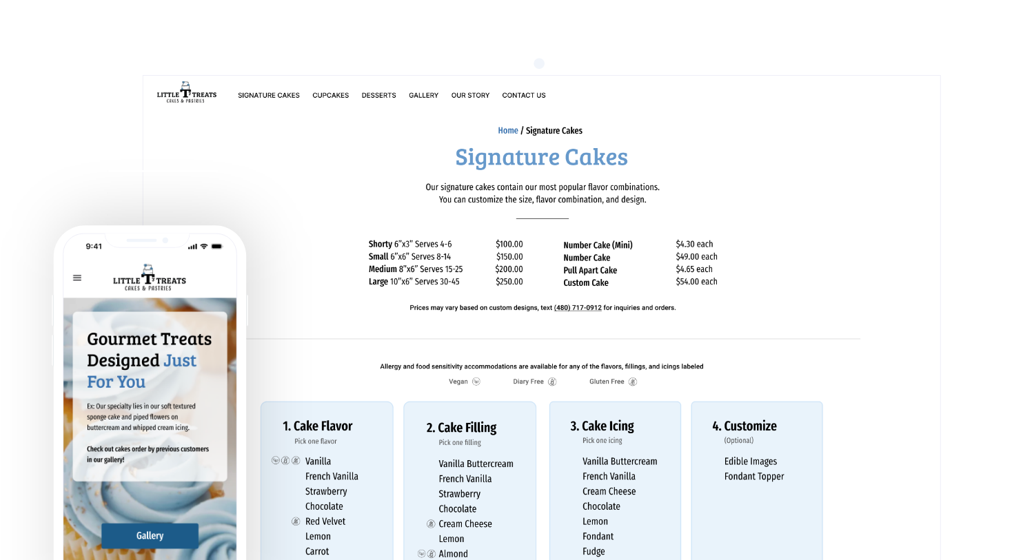
Little T's Treats is a local custom cake shop based in Scottsdale, Arizona, specializing in creating unique, custom-designed cakes for special occasions. Their primary customers are attracted by Little T’s Treat's Instagram and Facebook page. They want to increase its online presence by creating a website to attract new customers as well as returning customers.
The goal of the new website is to create a unified platform where customers can easily find information about the bakery's services and options.
ROLE & RESPONSIBILITY
Lead UX Designer
User Research, Interaction, Information
Architecture, Visual design, Prototyping & testing
April 2024 - July 2024
The Solution
How might we design a custom cake shopping experience so that it can be usable, accessible, and effective?
The problem is solved by a complete & thorough design of Little T's Treats that focused on:
• Usability & accessibility issues, uncovered during the Heuristic Evaluation.
• Aligning user and business goals based on user interviews and personas.
The Problem
Although the importance of an online presence steadily increased over the years, the worldwide crisis in 2020 accelerated the shift from offline to digital across industries. It became increasingly important for small business to build a digial footprint as well.
Little T's Treats does not have a unified platform to direct their customers to, in order to find information about the bakery's services and options. They currently only have a Facebook and Instagram page to showcase previous orders.
User Research
Competitive Research
I researched and conducted heuristic evaluations of various bakery websites in order to get a better understanding of the struggles around finding information about services, options and pricing. My research encompassed -
• Pain points customers face when trying to find specific information
• Instances where they were frustrated or confused
• Goals they have when visiting a bakery website
Key Highlights
Positives
• Pages, fonts, and brand are consistent across all pages.
• Clearly marked exits such as arrows back to the previous page.
• Phone number listed on multiple pages where you can contact the store for orders.
Major Issues
• Main navigation is not clear, issues understanding the wording and what page it is taking users to
• Content is overwhelming with options and is unorganized
Blocker Issues
• Dietary information could not be found, due to lack of specificity with the labeling and navigation
• Varying colors confusing & overwhelming (do not know what is clickable)
User Interviews
Next, I conducted user interview's with 7 participants because I wanted to empathize with the users and get an in-depth understanding of their values, perceptions, and experiences with custom cake shopping. An interview guide was prepared with a relevant set of questions and subsequently, a detailed report of interview findings is found right here.
"I trust a company more knowing that it's homemade, and that they make their desserts in-house."
“I would want to see pictures of all the different styles and types of cakes as well as pricing. As well as descriptions of what they are and the different sizes or how many people it feeds. ”
“As a dairy free customer, I want to have access to a list of ingredients, so that I can find allergy free desserts that are offered”
Insights
After conducting competitive research, user interviews and analyzing the gathered data, I was able to categorize the insights into these 3 categories
Trust/Authenticity
• Emphasize that desserts are made in-house to build customer trust and authenticity.
• A well-designed website (consistent design system) signals professionalism and reliability, boosting customer confidence in purchases and reviews.
Detailed Information
• Provide thorough descriptions, including types, sizes, and serving quantities, to help customers make informed decisions.
• Include pictures and clear pricing for all products to enhance the shopping experience.
Transparency
• Offer clear ingredient information to cater to customers with dietary restrictions.
• Provide detailed information on ingredients to help customers with specific dietary needs find suitable products.
Personas: Hi Amani!
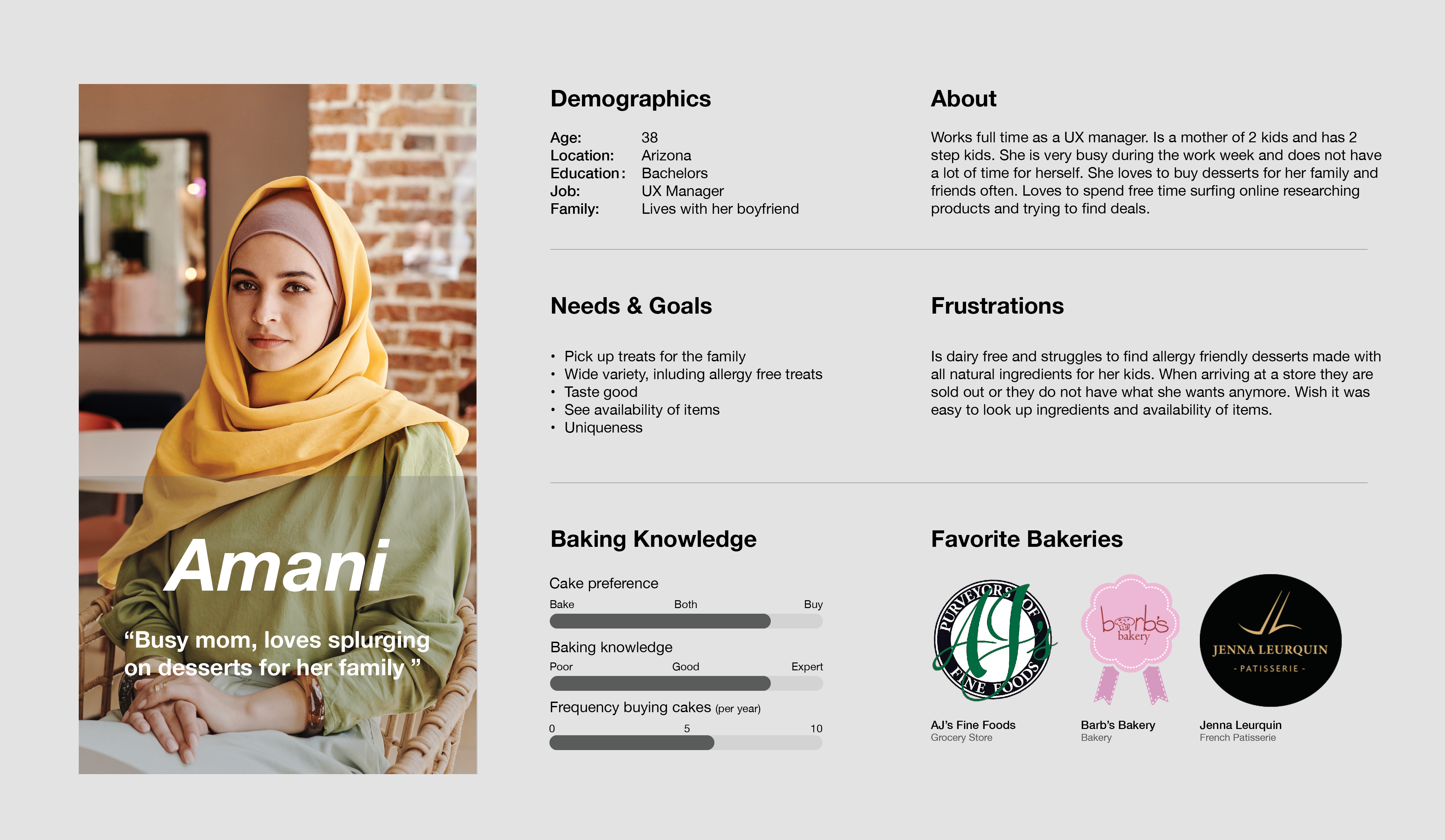
The research made it evident that there are problems that different users would face. To cater to this, I categorized them into three user profiles based on their goals and tasks. Meet Amani. Here, you can see her motivations, goals, needs, and frustrations.
1. Amani
"Busy mom, loves splurging on desserts for her family."
Goals/Needs
• Wide varity, including allergy friendly treats
• Uniqueness
Frustrations
• Struggles to find allergy friendly desserts made with all natural ingredients
• Nowhere to look up ingredients and pricing of items
2. Darell
"If I eat a dessert it needs to be worth the calories."
Goals/Needs
• Wants homemade dessers, using all natural ingredients
• Needs to see pictures of desserts before ordering them
• Does not want to eat anything processed
Frustrations
• Annoyed when desserts come out looking different than the images
• Nowhere to look up online to see if they use high quality ingredients
3. Oliver
"I want to have a good body, but not as much as I want dessert."
Goals/Needs
• Want to be able to look up options online
• Wants to be able to see images of treats and cakes online
Frustrations
• Struggles to find fresh desserts that are in his price range
User/Business Goals
With my target user’s goals and pains, it is time to align our user’s goals to our business goals to come up with a solution to benefit both the user and the business.
Business Goals
• Bring sales from instagram to website
• Branding
• Build a strong online presence
• Attract new customers
Business Pains
• Lots of requests about what business offers
• Many phone calls and dm's about services and options
Mutual Goals
• Up to date content
• Simple & clean UI design
• Custom cake unique to me
• Responsive website
• Enjoyable and seamless cake ordering experience
User Goals
• Receiving product as expected
• High quality product image
• Find cake/dessert information
• Easy ordering process
User pains
• Difficult to find information about cake
• Difficult to find information about cake
Conceptualization
I started creating the information architecture and low-fi concepts for the primary use case. We then began to conduct usability tests with the low-fidelity mock-up. Once we had confidence in the design, we began digitalizing designs.


Design System
After incorporating the stakeholder's feedback from the previous phase, it's time to start the visual design!
| "I want a simple and clean design, where the website showcases my style and clearly outline what my business provides." -Stakeholder
High-Fidelity Wireframes
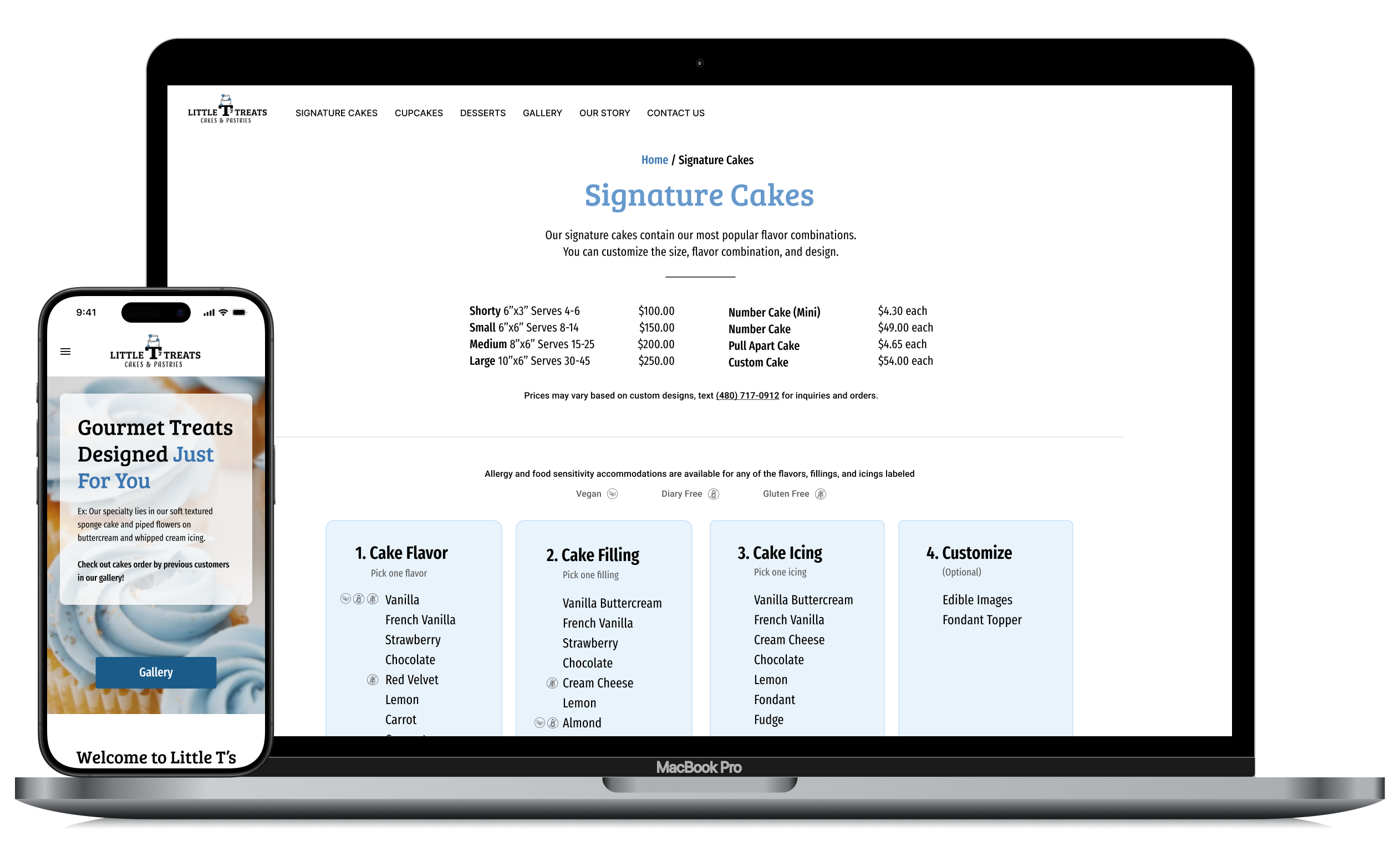
After finalizing the UI kit, I combined the mid-fidelity wireframes with the UI elements for both desktop and mobile designs.
Prototype
The Solution
After creating the entire information architecture and implementing all UI elements, I had a meeting with the client.
Once the designs were approved, I built the website in WordPress, developed a custom CMS, and trained the client on how to use it to keep her content up to date.

Project Learnings
1. Simplicity is strength
As a designer, we are often lured by attractive, trendy and out of the box designs. But, We must always remember the ‘why’. The primary goal is to understand the user, their problems and then come up with a design that solves it.
2. Prioritize
Create a strategic plan to launch an MVP. This helps deal with out-of-scope requests that could potentially derail the project and helps deliver a quality product in time.
3. Seek out feedback early and continually
The trouble with most of us is that we would rather be ruined by praise than saved by criticism. Keeping the stakeholders/users in loop and testing solutions in whatever form (paper, low-fi or hi-fi) as early as possible saves ample amount of time and re-work
Next Steps...
Following the wireframes and the prototype, I will do a thorough usability testing to see what works and doesn’t work on the user’s end. From there, I will make more iterations and create more flows in the project.
More Projects
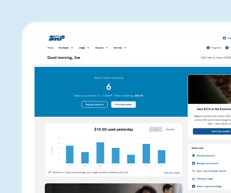
SRP My Account ExperienceProject type
Smart City ConnectProject type
Cost Breakdown RefreshProject type
Gender InclusionProject type
Lets Connect!
Fell free to reach out for collaborations or just a friendly hello! 👋
