MPower My Account
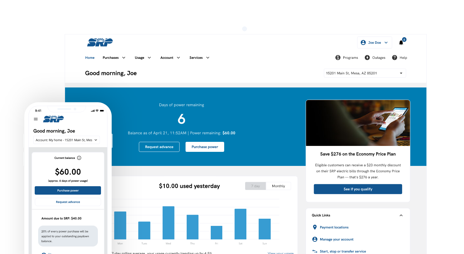
SRP M-Power is a pay-as-you-go solution for budget-minded customers, allowing you to choose when, where and how often to pay for energy — before you use it.
OVERVIEW
Salt River Project (SRP) is one of Arizona’s largest public utilities, serving millions of electricity and water customers. As part of a company-wide Customer Modernization initiative, SRP partnered with SEW to redesign the M-Power My Account experience—a platform prepaid customers rely on daily to monitor usage, check balances, make payments, request advances, and manage alerts.
Led the end-to-end research and design to evaluate the new cross-platform design before development. The goal was to validate that the proposed experience supported real customer needs, identify usability issues and terminology confusion unique to prepaid customers, and leverage research findings to iterate on and deliver actionable, design solutions that directly informed product and engineering implementation.
ROLE & RESPONSIBILITY
Product Designer
UX Research, Sketching, Prototyping
Interaction Design
Tools & Technology
Figma, Miro, Optimal Workshop
Jan 2025 - Mar 2025
The Problem
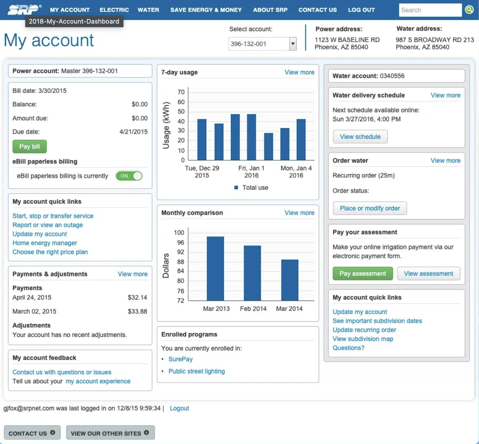
M-Power customers rely on My Account daily to manage prepaid electricity, where clarity and trust are critical. The existing dashboard felt crowded and outdated, combining payments, usage, billing, and unrelated content in a single view—making it hard to focus on key tasks.
As SRP modernized the experience, new layouts and terminology had not yet been validated with prepaid customers, a group highly sensitive to cost accuracy and transparency. Research was needed to ensure the redesigned experience supported fast, confident decisions before development.
Research Questions
Once I aligned with the business partners and gathered their objectives, I translated those requirements into research questions. This helped guide the study, ensuring that I am trying to solve the right problem and could measure success effectively.
• Does the redesigned dashboard support fast, confident account management for prepaid customers?
• Are usage, balance, and payment concepts communicated clearly across devices?
• Where do terminology and navigation introduce hesitation or mistrust?
• Which design elements should be refined before development to reduce friction and support adoption?
Methodology
We conducted moderated prototype tests with 8 current MPower customers to help determine users' motivations, behaviors, concerns, and preferences while exploring the new My Account site.
My research encompassed -
• Evaluating core account management workflows (balance, payments, alerts)
• Understanding information architecture and feature discoverability
• Assessing usability across desktop, mobile web, and app
• Identifying gaps, pain points, and opportunities for improvement
Constraints & Considerations
Before starting the study, I identified key factors that could influence both the research and design. The following constraints and considerations helped guide recruitment, focus areas, and anticipate potential challenges during testing:
• Prepaid customers have heightened sensitivity to cost accuracy and clarity
• Designs were mid-to-high fidelity but not yet in development
• Terminology was influenced by internal billing systems and could not be fully renamed
• Mobile usability was critical due to frequent on-the-go usage
User Sample & Segmentation
Participants represented four core M-Power customer segments, each influencing different design considerations.
1. Young Unestablished Idealists
New, tech-savvy customers learning how prepaid energy works.
Why it matters:
This group needs onboarding clarity and transparent terminology to build early trust and confidence in managing their account.
2. Salt of the Earth
Budget-conscious customers who carefully track balances and rely on reminders.
Why it matters:
This group is most vulnerable to confusion or misinterpretation of balances, making clear language, reassurance, and predictable payment behavior essential.
3. Stretched & Struggling
Customers living paycheck to paycheck who check balances frequently to avoid overdrafts.
Why it matters:
Even small usability issues or unclear timing of payments can have real financial consequences, requiring precision, speed, and low cognitive load.
4. All About Me
Independent, tech-savvy users who log in occasionally to complete tasks quickly.
Why it matters:
This group values efficiency and minimal friction, reinforcing the need for clear shortcuts and fast access to key actions.
Key Tasks Evaluated
This study focused on the core workflows customers use to monitor balances, manage payments, and control automated features within My Account. While multiple tasks were evaluated, the sections below highlight the workflows that most strongly influenced design decisions and surfaced usability risks.
Review Dashboard & Usage
Evaluated whether customers could quickly understand current balance, recent usage trends, and cost implications without second-guessing accuracy.
Make a Payment
Assessed clarity and confidence when navigating payment history, selecting payment amounts, and completing transactions.
Analysis of past payments shows 50% of transactions ranged from $15–$50 (median $25), and 92% were under $100.
Automation, Alerts & Control
Evaluated whether customers understood and trusted automated features such as Auto Reload and notifications, including trigger logic, alert timing, and customization.
*Additional tasks evaluated included requesting an advance, managing notification preferences, and reviewing billing terminology.
Analysis
Insights from moderated usability sessions were synthesized using affinity mapping to identify recurring patterns and themes. These themes were then translated into an empathy map to support analysis and key findings.
Key Findings
After conducting user interviews, contextual inquiry and analyzing the gathered data, I was able to categorize the insights into these 4 key findings
The new experience increased confidence and perceived professionalism
All participants had a positive experience with the redesign, and 50% of users (4 of 8) explicitly preferred it over the current My Account. Many described the new design as cleaner, easier to use, and more professional.
Core tasks are discoverable, but flexibility is limited
While all participants successfully completed the key tasks, most users (5 of 8) wanted more control over payment amounts and clearer timing of withdrawals to feel fully confident in managing their account.
Billing terminology creates hesitation and misinterpretation
Multiple payment views and terms like "Billing" and “Balance details” caused confusion as prepay customers do not have a typical 'bill'. 3 of 8 participants misinterpreted ‘Pay back percentage’ as interest, requiring clarification.
Automation features lack clarity and visibility
7 of 8 users expressed interest in an Auto Reload feature, but they wanted the ability to customize triggers and notifications. Some participants initially overlooked the feature due to its ad-like presentation, which reduced visibility.
Design Implications
This research informed clear design guidance prior to development, including:
• Emphasizing precision and transparency in usage data for prepaid customers
• Simplifying payment-related navigation on mobile
• Clarifying automation triggers and notification controls
• Reducing redundant views of financial information
Outcome
Findings were shared with the product team and SEW to inform pre-development refinement. The research revealed critical usability issues — for example, the billing history page was so confusing that the team decided to completely redesign it. Recommendations were iteratively applied and retested, ensuring solutions aligned with user needs before engineering handoff.
Project Learnings
1. Customers need clarity over flexibility
Prepaid users want options like custom payment amounts and adjustable automation triggers, but they value clear, predictable behavior over flashy features.
2. Terminology matters deeply
Even seemingly simple terms like “Balance Details” or “Billing” can confuse prepaid customers. Language must map directly to how users think about their money.
3. Immediate feedback builds trust
Users respond positively to instant confirmation of actions (payments, alerts, or advances), reinforcing confidence in the platform.
National Recognition
After launching the My Account redesign, J.D. Power ranked SRP 2nd overall (out of 48) in their 2024 Utility Digital Experience Study for large sized utility providers. SRP scored 653 points, where in the national average was nearly 50 points lower at 594. The study focuses on how well utilities engage with their customers through digital channels, such as websites, mobile apps, and online billing systems. Users of the study commended SRP’s web portal for its incredible ease of use, easily accessible information, and overall pleasing aesthetic.
More Projects
Little T's TreatsProject type
Smart City ConnectProject type
Cost Breakdown RefreshProject type

Gender InclusionProject type
Lets Connect!
Fell free to reach out for collaborations or just a friendly hello! 👋