
ESS Gender Inclusion
An all-new benefits enrollment experience that empowers LGBTQ+ employees to be their more authentic selves.

OVERVIEW
Willis Towers Watson is a British-American multinational company providing insurance advisory, broking, and solution services all over the globe. They provide products and services to clients to help them manage risk, cultivate talent, and optimize benefits.
The aim of this project was to solve the problem of a lack of gender inclusive options within Employee Self Service, a self service benefits tool. While ensuring employees get appropriate medical coverage based on their gender selection.
ROLE & RESPONSIBILITY
UX RESEARCHER
User Research, Interaction, Prototyping & testing
May - Sep 2023
The Solution
ESS Next is taking a step in the direction of gender inclusivity by making it easy for members of the LBGTQ+ community to designate their sex and get appropriate medical coverage - whatever their gender identity- using clear and concise language.
Reassuring users that there is a legitimate need to capture such information, so that they can confidently make a selection to ensure that medical care is provided by the carrier.

The Problem
Getting appropriate health coverage can be difficult, especially when only binary gender options are provided. This does not accurately represent all gender situations or sexual identities. WTW wants all of their client’s employees to feel empowered and secure when enrolling in insurance benefits.
Lack of inclusion and gender identity options can become a barrier to a businesses success.
A non-gender inclusive system, creates higher turnover, decreased engagement, lost productivity, and possible litigation.
Competitive Research
I researched various journals, hospital forms, and LGBTQ Health Education programs in order to get a better understanding of the struggles surrounding gender and enrolling in medical insurance. My research encompassed -
• Concerns LGBTQ+ users face when enrolling in benefits
• Instances where their gender identity was not fully understood
• Goals they have during Annual Enrollment
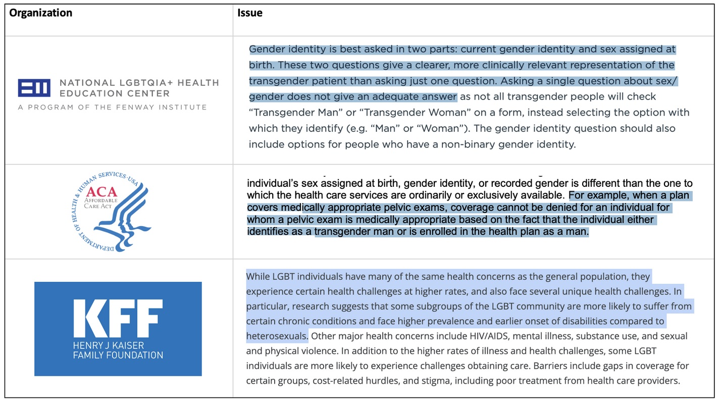
Fig: Screenshots of important quotes found from competitive research to understand the major pain points & to narrow down what will be redesigned.
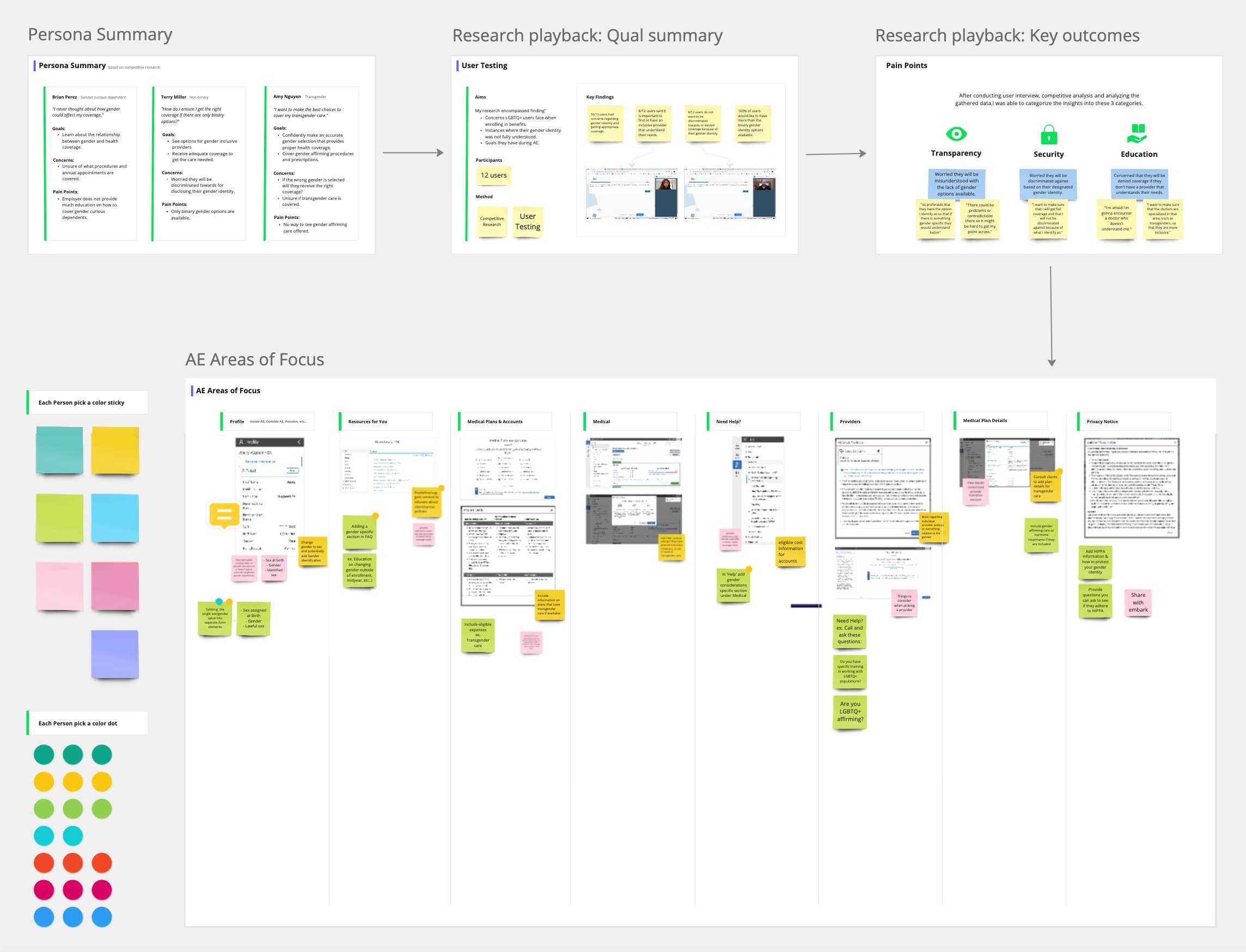
Personas
The research made it evident that there are problems that different users would face. To cater to this, I categorized them into three user profiles based on their goals and tasks.
1. Brian Perez - LGBTQ Dependent
“I never thought about how gender could affect my coverage."
Goals
• Learn about the relationship between gender and health coverage.
Concerns
• Unsure of what procedures and annual appointments are covered.
Pain Points
• Employer does not provide much education on how to cover gender curious dependents.
2. Terry Miller - Non binary
"How do I ensure I get the right coverage if there are only binary options?"
Goals
• See options for gender inclusive providers.
• Receive adequate coverage to get the care needed.
Concerns
• Worried they will be discriminated towards for disclosing their gender identity.
Pain Points
• Only binary gender options are available.
3. Amy Nguyen - Transgender
“I want to make the best choices to cover my transgender care."
Goals
• Confidently make an accurate gender selection that provides proper health coverage.
• Cover gender affirming procedures and prescriptions.
Concerns
• If the wrong gender is selected will they receive the right coverage?
• Unsure if transgender care is covered.
Pain Points
• No way to see gender affirming care offered.
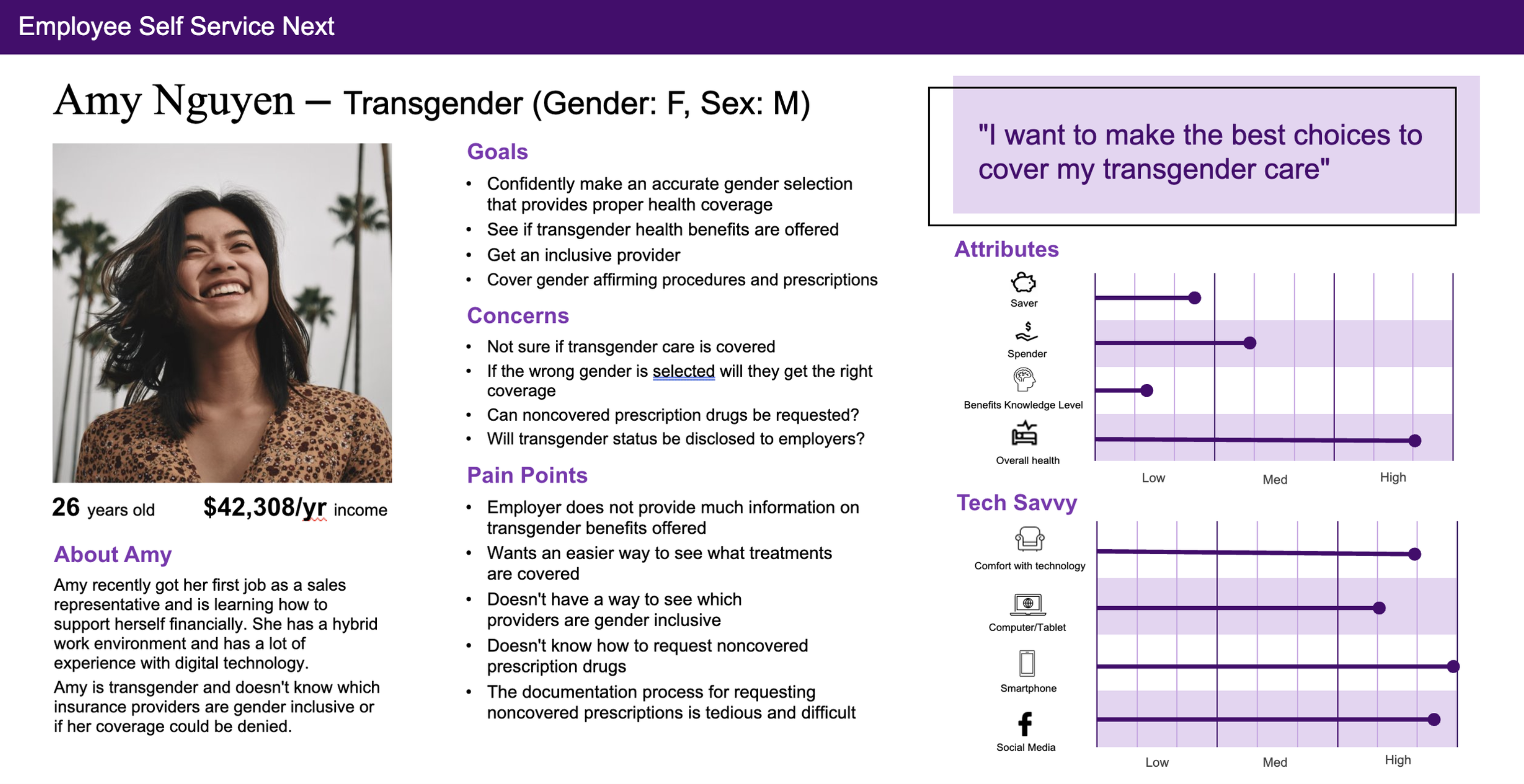
Fig: Screenshot of one of the personas created to understand and identifying the demographics we are targeting.
Insights
After conducting user interviews, contextual inquiry and analyzing the gathered data, I was able to categorize the insights into these 3 categories
Transparency
• Only binary gender options available
• Does not accurately represent all gender situations
• Gender and sexual identity are being misunderstood due to lack of options
Education
• Only binary gender options available
• Does not accurately represent all gender situations
• Gender and sexual identity are being misunderstood due to lack of options

Security
• Only binary gender options available
• Does not accurately represent all gender situations
• Gender and sexual identity are being misunderstood due to lack of options
Surveying
The complexity of each gender identity and their individual goals and pain points needed to be laid out in detail. In order to achieve that, I conducted a survey to gather as much detail from the end users to understand challenges they are facing when enrolling in insurance benefits and what goals they have in order to optimize pain points.
“Its preferable that they have the option I identify as so that if there is something gender specific they could understand better.”
“I want to make sure that I will get full coverage and that I will not be discriminated against because of what I identify as.”
“I'm afraid I'm gonna encounter a doctor who doesn't understand me.”
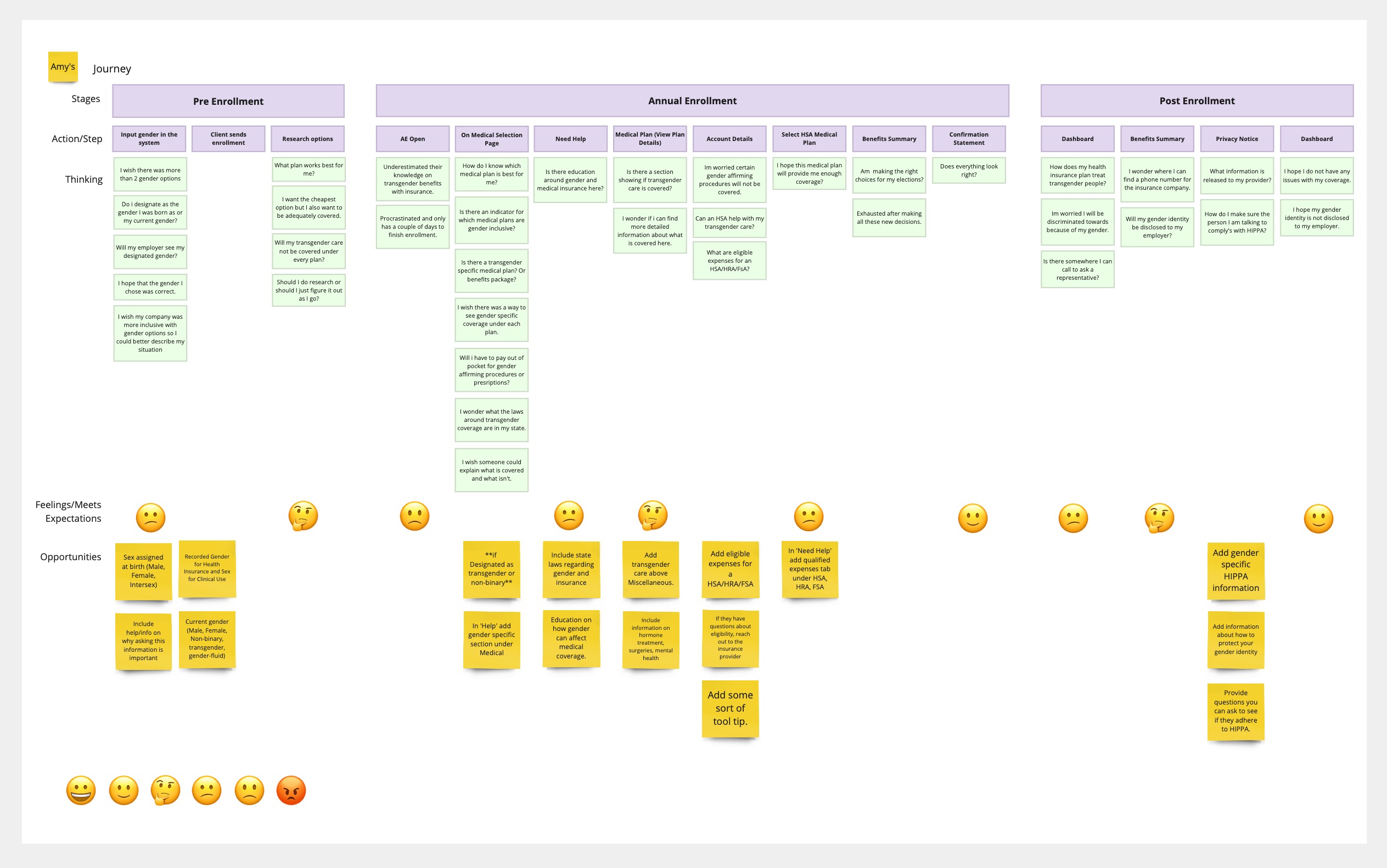
Journey Mapping
Based on the information gathered, we identified primary pain points and key areas of opportunity within each possible stage of the Annual Enrollment process.
Stakeholder Workshop
Together with the product team and stakeholders we brainstormed solutions on Miro and ranked the best ideas. We kept in mind ease of use, transparency, and a welcoming experience. We wanted to ensure the pain points were met and so we looked at what could be done better to provide users clarity and educate them on getting appropriate coverage.
Pivoting
While considering areas of the product we should focus on, the workshop unveiled a level of complexity regarding discrimination and catering to all types of users. This sparked an idea of a new feature in the future where we could create custom experiences that are inclusive of all users. ie diabetes, cancer treatments, hormone treatments.
At this point in time, we are focusing on the verbiage of ‘Gender’ and how we can refocus it to ensure users make a selection that ensures that they get the appropriate medical care provided by the carrier.
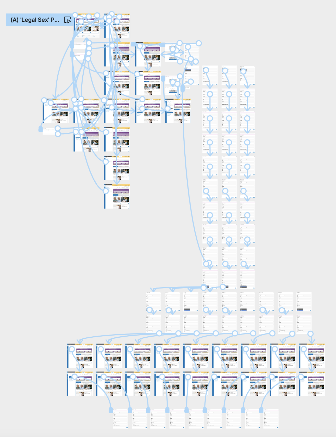
User Testing
Prototypes were used to conduct A/B testing on these different concepts to confirm the new verbiage and workflow, identifying roadblocks and/or expose missed requirements. All findings were documented into a usability test report which was presented to product with design solutions.
Key Findings
• Users interpreted the meaning of ‘Legal Sex’ as sex assigned at birth, but designated as their current gender.
• Some people can have documents with multiple legal sexes listed, causing confusion on how to designate.
Refining
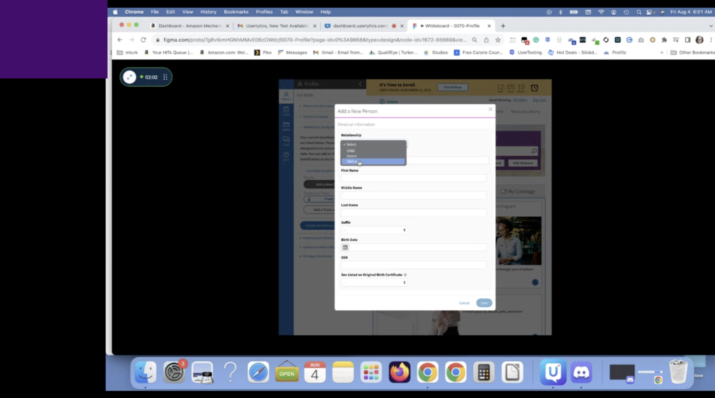
We had a group of 25 participants go through the process of adding a beneficiary who was born a female but now identifies as a transgender (male) to their coverage.
This proved to be a great way to gather more direct data on users interpretation of the verbiage of ‘gender vs sex’ and how we could iterate on the wording and design to ensure appropriate coverage is afforded.
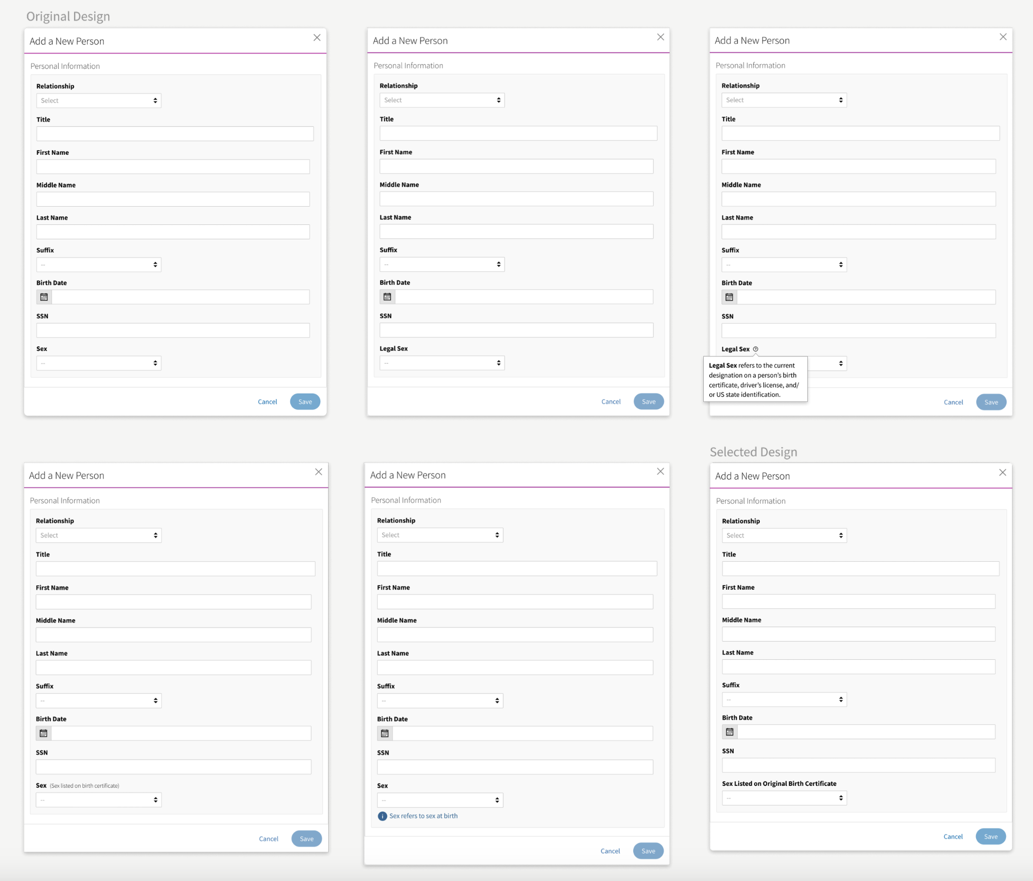
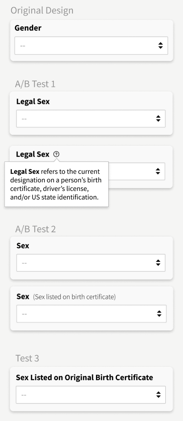
Iterations
Design iterations were done in all phases of the design process, and each iteration before influenced the design of the next iteration. The following design iterations were created to test the use of ‘Legal Sex’ as an input field. The verbiage and popover was hard to discover and had caused confusion as to the sex that should be designated.
The final iteration of the title verbiage to ‘Sex Listed on Original Birth Certificate’, gave enough visual clues to prompt the user to provide their biological sex even when they initially wanted to put their current sex.
Seeing Results
The new verbiage was well received by the users and stakeholders. Users reported the title was easy to understand, there was no confusion as to how to designate, and they feel more confidant making a sex selection.
Seeing Results
The new verbiage was well received by the users and stakeholders. Users reported the title was easy to understand, there was no confusion as to how to designate, and they feel more confidant making a sex selection.
Project Learnings
1. Simplicity is strength
As a designer, we are often lured by attractive, trendy and out of the box designs. But, we must always remember the ‘why’. The primary goal is to understand the user, their problems and then come up with a design that solves it.
2. Prioritize
Create a strategic plan to launch an MVP. This helps deal with out-of-scope requests that could potentially derail the project and helps deliver a quality product in time.
3. Seek out feedback early and continually
The trouble with most of us is that we would rather be ruined by praise than saved by criticism. Keeping the stakeholders/users in loop and testing solutions in whatever form (paper, low-fi or hi-fi) as early as possible saves ample amount of time and re-work
More Projects
Lets Connect!
Fell free to reach out for collaborations or just a friendly hello! 👋


