
Cost Breakdown Refresh
Reimagining WTW’s Cost Breakdown experience within employee Self Service.
OVERVIEW
Willis Towers Watson is a British-American multinational company providing insurance advisory, broking, and solution services all over the globe. They provide products and services to clients to help them manage risk, cultivate talent, and optimize benefits.
The aim of this project was to update the UI of the current Cost Breakdown system within Employee Self Service and ensure employees have the best user experience when looking at their benefits they enrolled in for the current year.
ROLE & RESPONSIBILITY
UX/UI DESIGNER
User Research, Interaction,
Visual design, Prototyping & testing
May - Sep 2023
My Role
I worked closely with the UX team as a designer, where I gathered requirements, researched competitor sites, worked with component libraries, created wire-frames, mock-ups and digital prototypes. Created design documents for development.
The Problem
WTW’s Cost Breakdown needed an updated look that reflected their new branding, and enhancements that could improve the users experience when reviewing their new benefits. WTW’s current Cost Breakdown only highlighted users current benefits but did not allow the the option to compare their costs to the previous year.
Product Requirements
Rebrand Update
• Page should be designed to fit the updated rebrand so it is consistent with all other pages across the product.
Add Enhancments
• Show information on employee contributions, last years benefits, and other valuable information
Simplify Content
• Translate data into a meaningful and organized format so that it is easier to read.
The Results
Together with the UX team we successfully turned the user experience design around within the business requirements. The stakeholders were very happy and the page was updated and simplified to provide a better user experience.
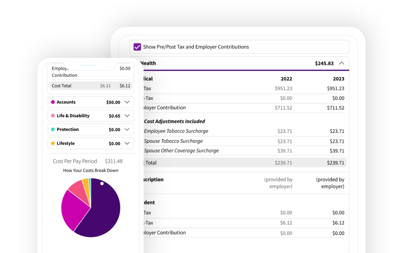
Before
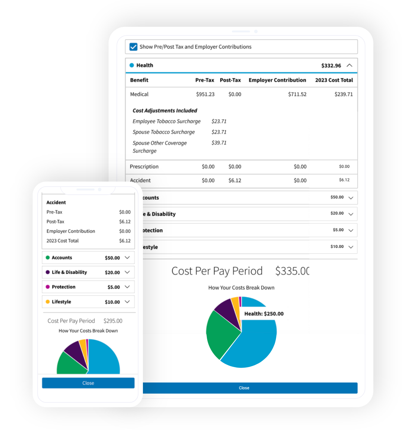
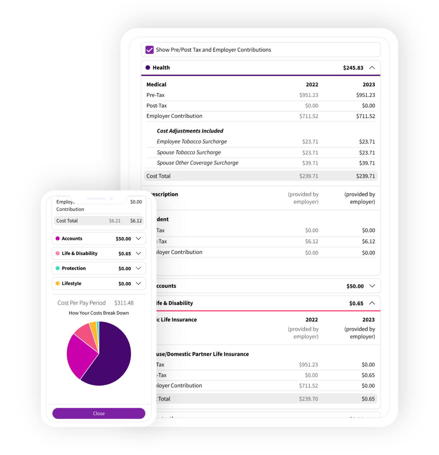
After
Discovery Phase
I was told to focus on 3 areas when brainstorming ideas for the refresh. The UX team believe these points could be beneficial to implement on the Cost Breakdown page:
• Possibly remove the 0$ benefits
• Show employee contributions
• Look at shopping cart options for brainstorm
High Fidelity Wire-Frames
Multiple wire-frames were created with different ideas and iterations based off the information I was given from the UX team. I then presented these ideas to the team in our standup call to get feedback and make further iterations.
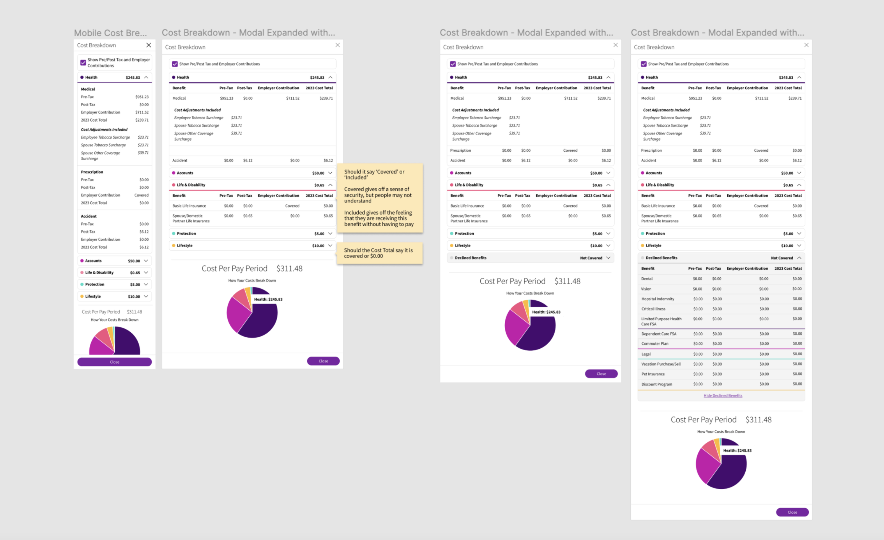
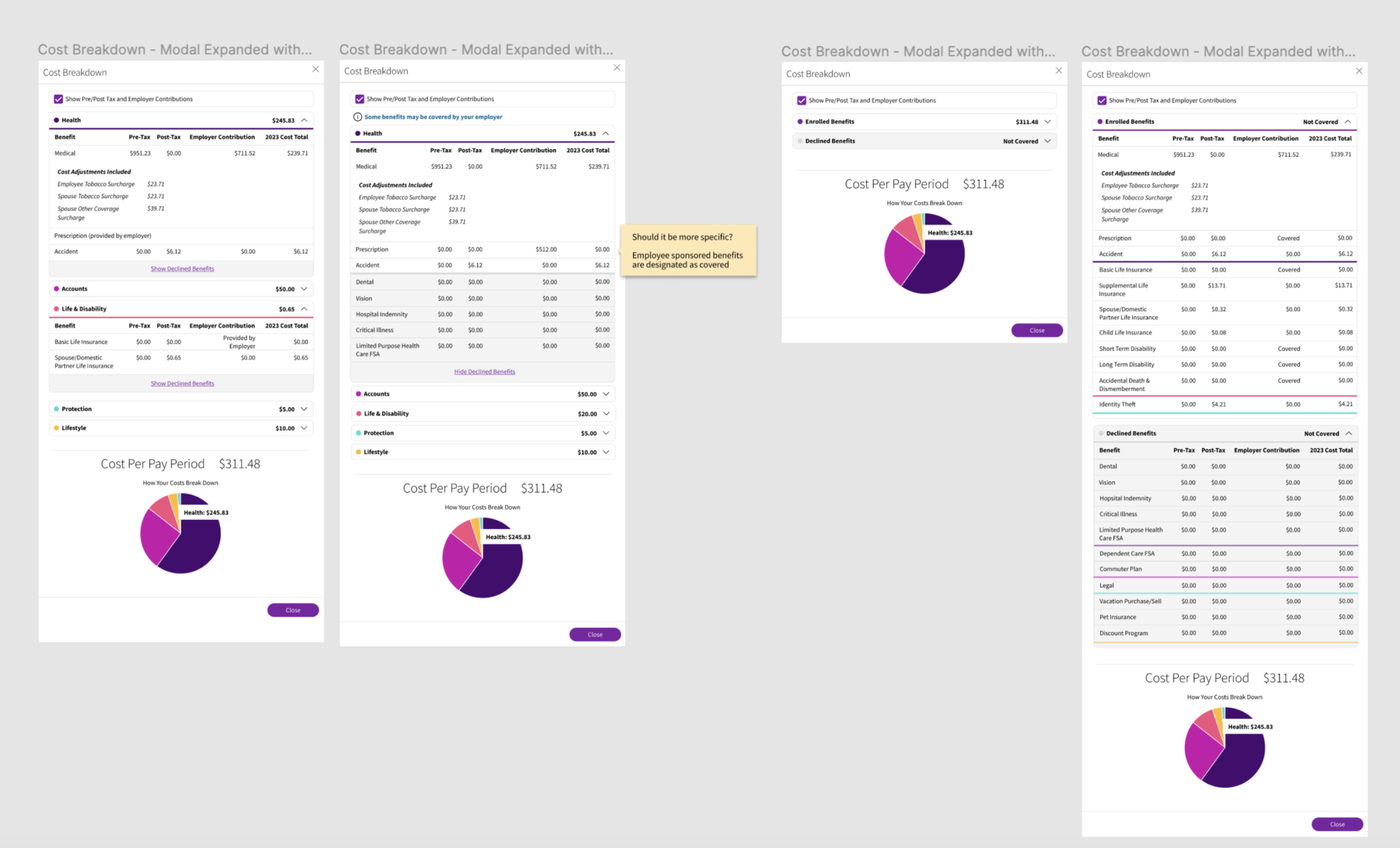
Iterations
After talking to the team, some user research surfaced that users were frustrated that they did not have a way to compare their current year cost benefits to the previous year costs. Simplicity was key here since so much information needs to be contained in this one page.
We wanted to incorporate some of the ideas from the first set of designs in our new comparison tool.
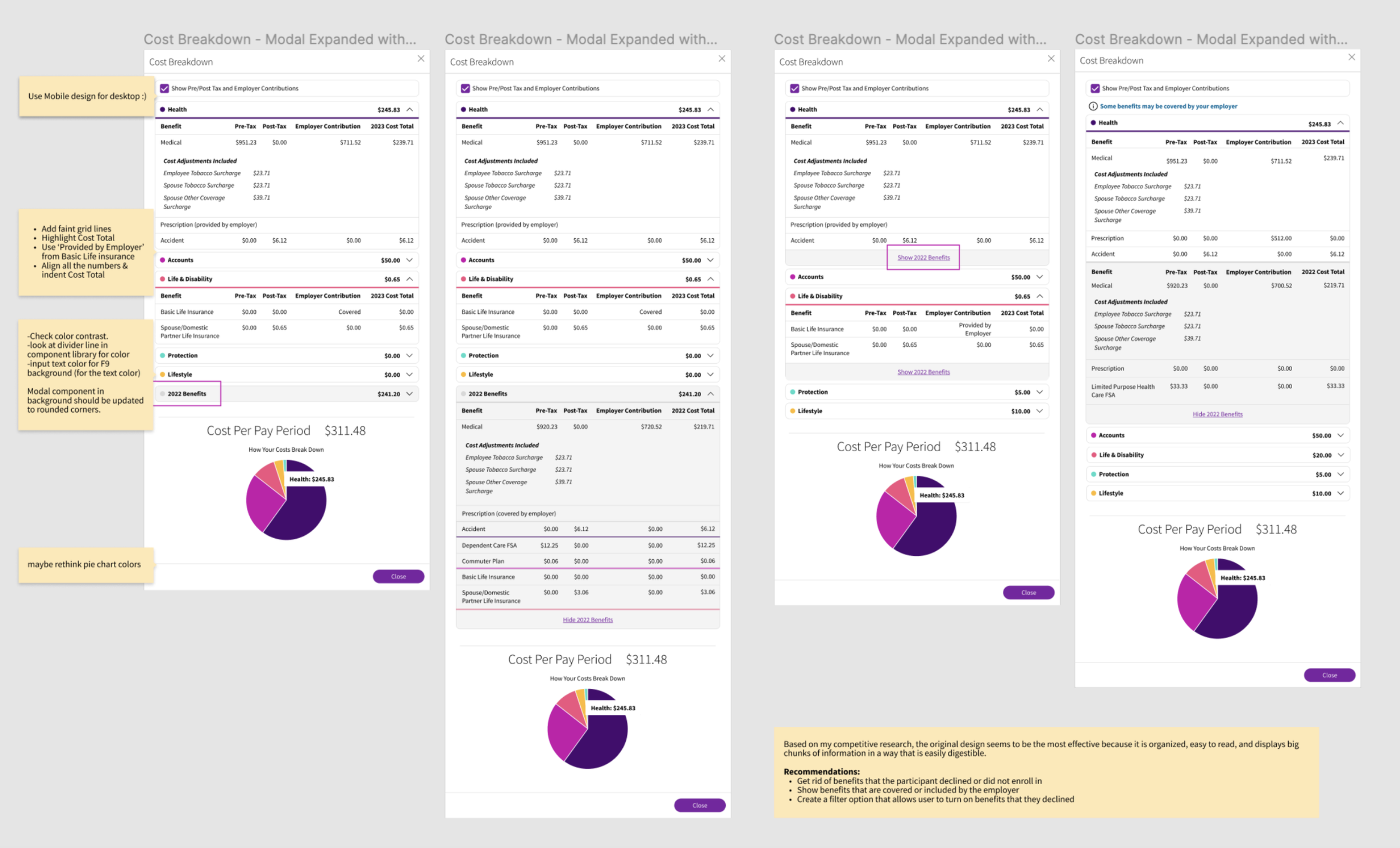
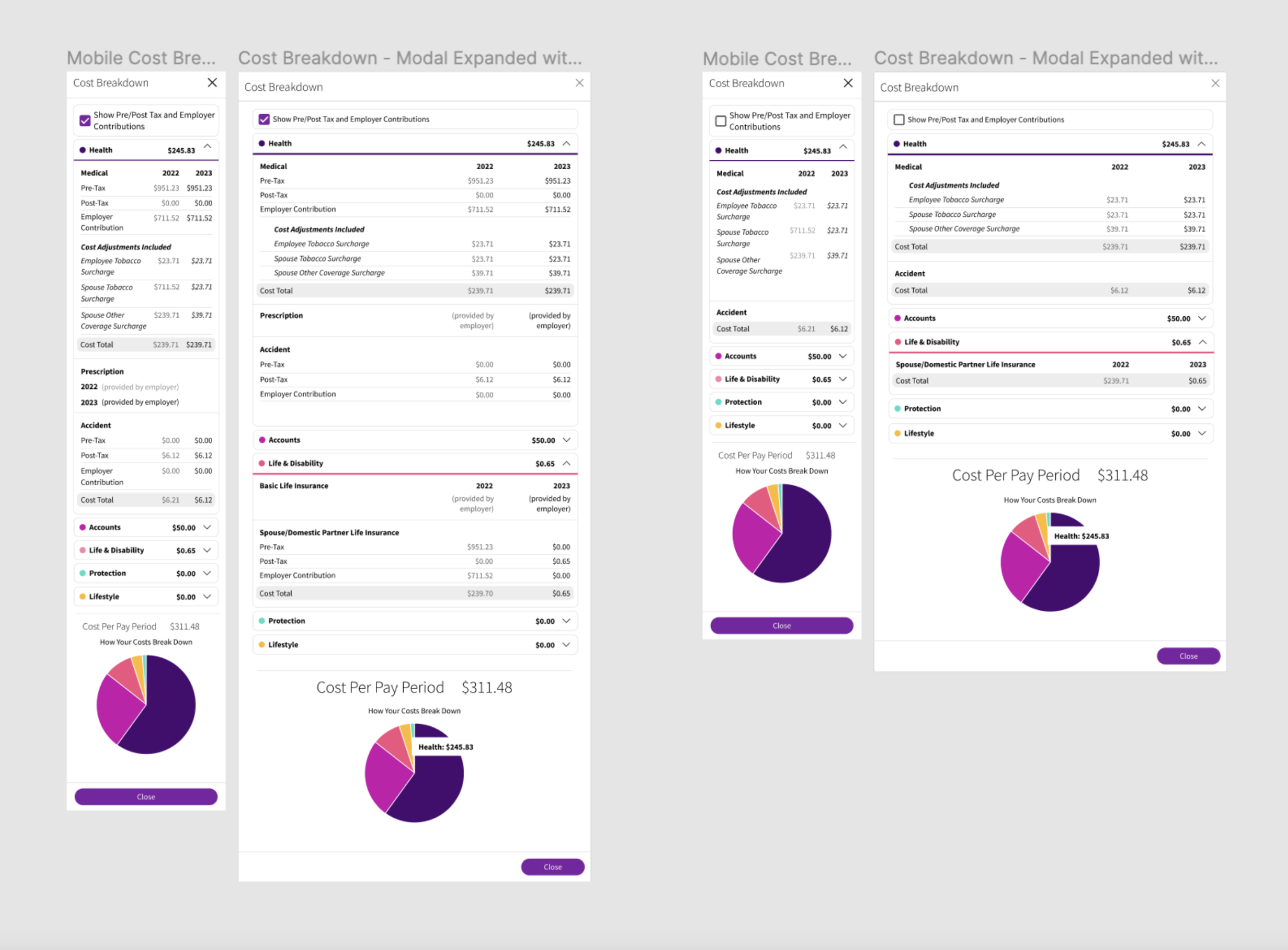
Final Design
By taking a Mobile first approach, the best design was to:
• Use the same mobile design for desktop
• Add grid lines to separate sections and simplify the design
• Highlight the cost total
• Align all costs to make it easier to compare
Testimonials
"Very easy to use and follow along. Everything was laid out in an orderly fashion - no confusion about what I was doing."
CBRE
"The best thing in the enrollment process is seeing last years options you selected next to the next years options."
CBRE
"Love the new look and feel as well as showing previous year's selections."
Comerica
Project Learnings
1. Simplicity is strength
As a designer, we are often lured by attractive, trendy and out of the box designs. But, we must always remember the ‘why’. The primary goal is to understand the user, their problems and then come up with a design that solves it.
2. Prioritize
Create a strategic plan to launch an MVP. This helps deal with out-of-scope requests that could potentially derail the project and helps deliver a quality product in time.
3. Seek out feedback early and continually
The trouble with most of us is that we would rather be ruined by praise than saved by criticism. Keeping the stakeholders/users in loop and testing solutions in whatever form (paper, low-fi or hi-fi) as early as possible saves ample amount of time and re-work
More Projects
Lets Connect!
Fell free to reach out for collaborations or just a friendly hello! 👋


